Tyson Murphy
 Murphy’s is a fantasy inspired artist, I found him because
he created a lot of character designs for game companies such as blizzard. This
digital painting of a tribal warrior girl is one of my favorite pieces of
his, this is because the artist has used very light and soft tones which
contrast to his usual work, where he normally creates dark and gruesome
creatures.
Personally, I would love to learn how to paint digitally like
Tyson Murphy. I love the way he softly blends his tones, yet still contrasts
the colours with dark and stronger ones. I would also love to learn the ways in
which he can take a 2D digital painting, and make it look more realistic and
life like, just by using highlights and shadows.
Kozyndan
Bunny blossom is a piece from kozyndans collection entitled
‘Seasons of the Bunnies’, this design is in fact the representation of spring
in the collection. I personally love the ‘bunny’ pieces that they create, I
enjoy them because they are quirky and I feel they show the personality of the
artists. The pieces are always beautiful overall, but I do enjoy looking more
into the details and finding where some of the bunnies may be hidden. This
specific piece is inspired by old ukiyo-e woodblock prints, this is what gives
their pieces a more Japanese look, as they do appear very delicate, but when
looked at closer, have strong, bold line work.
I love this artist’s work as most of their designs are somewhat
illusions. You may think that you are seeing something good in their designs,
however if you look more closely, you will see something very different. For
instance, in this specific piece, at first glance you may see a little boy
hugging his teddy bear. Yet after a second glance, you see that the bear is
actually sawing off the little boy’s leg, and as the teddy bear already has a
human arm, I could only guess that he is sawing off the leg so that he can use
it himself.
Color Orgy create pieces with a 50s illustration style but with a
revamped twist. This I feel allows the artist to create more darker themed
designs, yet still have a colourful and happy outer shell in the way that 50s
illustrations use to have.
I tend to enjoy more illustrations which seem to have a dark
humour twist to them. In the ones that I have seen, the darkness behind the
piece has never been visible at first glance. This is something that I want to
learn and eventually incorporate into my own work as I do find a lot of people
like this type of humour and illustration, and it also lets the audience get to
know the artist more. This also shows me that there is no limits to what you
can show and create, as it can always appeal to someone somewhere.
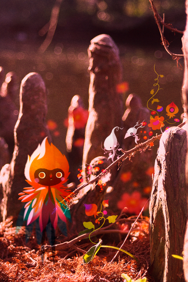
Lorena Alvarez
 In this design, Alvarez has taken a photo of something she
has found in nature. From this photo, she has started digitally adding
characters and little floral elements. This has given a simple photo more depth
as it has now become a background to a character’s story.
As the artist has played around with the opacity of her characters
and floral aspects, it gives more narrative to the overall image as the figures
now seem like tiny little spirits. Changing the opacity has also made the
figures look more a part of the illustration as they don’t look too harsh, and
the colours work with the surroundings.
After looking more at Alvarez's work, I want to start creating
more stories and illustrations on top of simple photos. I enjoy the ways in
which she has used the surroundings in her photos, to build a narrative and
build on each of her character’s personality.
Comments
Post a Comment