Sheldo Design & Illustration
Laura Sheldon
Laura Sheldon is a freelance commercial illustrator and
designer, and when she is not working on a client based project, she retreats
to her solitude, creating work for herself, which is later sold on her Etsy
store. She had come in to discuss her job, what exactly she does, how she has
gotten to this point, and in general, she was giving us advice on the industry.
The most important advice I had taken away from this lesson, was to get your
name out there and let people know that you are an illustrator, whether it's
your family, friends, friends of friends, colleagues and so on, because you
never know when an opportunity may spring up, in which one of these people
could ask for your help or refer you to the person in need.
For the lesson, she had given us one of her own briefs that
she had previously worked on, for a bar in Paris called 'the little red door'.
The bar tenders had created their own cocktails for each 'Universal Value',
based on their own associations with the specific work or meaning, it was then
Laura's job to illustrate each persons interpretation of the word. These
illustrations were later compiled together into a cocktail menu for this bar.
The 'Universal Values' were:
POWER: Social status and prestige, control or dominance over
people and resources.
ACHIEVEMENT: Personal success through demonstrating
competence according to social standards.
HEDONISM: Pleasure or sensuous gratification for oneself.
STIMULATION: Excitement, novelty, and challenge in life.
SELF-DIRECTION: Independent thought and action - choosing,
creating, exploring.
UNIVERSALISM: Understanding, appreciation, tolerance, and
protection for the welfare of all people and for nature.
BENEVOLENCE: Preservation and enhancement of the welfare of
people with whom one is in frequent personal contact.
TRADITION: Respect, commitment, and acceptance of the
customs and ideas that traditional culture or religion provide.
CONFORMITY: Restraint of actions, inclinations, and impulses
likely to upset or harm others and violate social expectations or norms.
SECURITY: Safety, harmony, and stability of society, of
relationships, and of self.
 So for our first task, we had to pick two of these words
then create a mind map of all the words/imagery we associated with the specific
word/meaning. I had chosen benevolence and tradition because they had sparked
the most inspiration for me.
As Laura had told us that some of the bartenders had used
personal memories for their association, I had chosen 'Tradition' for the same
reason. It had made me think of the yearly tradition I have, in which I stay up
all night on Christmas Eve Eve doing a movie marathon of the Lord of the Rings
and Hobbit trilogies. This started as a way for me and my brother to be able to
sleep on Christmas Eve, because the excitement of Christmas would normally keep
us awake, however staying up all night would make us so tired that we would
have no choice but to sleep. But this has now evolved into me just doing the
marathon out of habit/tradition, and I do still enjoy it, especially now that I
can appreciate the movies more than my 12 year old self did, and I can share
this crazy tradition with my boyfriend, and it has even spread to my friends
participating as well.
I had chosen Benevolence because of the imagery that had
sparked in my mind when reading the meaning of the word. As it had said
mentioned preservation, this had made me think of 'Beauty and the Beast' and
the rose in which the Beast keeps protected/preserved inside of the dome, this
then lead to me thinking of more things, such as science, freezing, sheltering,
ageing and so on.
With these mind maps, we were told to pick our top 3
concepts and were given 15 minutes to sketch them out. Ideally, Laura had
wanted us to have one that would be more directed to the client, one that would
be more out of the box, and one that was in-between.
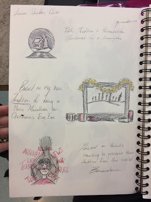
 My more client based design was a combination of both the
words Benevolence and Tradition, as I wanted to create a snow globe which
preserved a specific moment in time, this moment was Christmas, which is a very
common, yearly tradition for some people. I felt this would be better suited to
the client as I believed it could be more relatable to a wider audience, than
something that was more personal to me.
My second concept was based on my movie marathon tradition.
As Laura said we could use our own memories, I still wanted to create this
design, because although this may not be relatable to everyone, I still feel I
have made the imagery readable enough for the audience to understand what is
happening or form their own assumptions of the piece.
My final and more 'out of the box' concept was based on the
word Benevolence, as I wanted to create a parent trying to shelter their child
from the terrors of the world, preserving their innocence. Instead of creating
a character for the parent, I decided to create a silhouette so that the figure
could be more illusive as to who it was, whether it a parent, guardian, aunt,
uncle, friend or foe, I wanted the figure to be up for interpretation by the
audience. I feel this piece has a deeper meaning that the other two, which is
why it is my more 'out of the box' concept, as I believe a client would want a
more commercial based illustration, as opposed to a piece with symbolism and
deeper meanings inside of it. I also believe my sketch is quite creepy in a
way, so I do not believe this would appeal to the clientele of a cocktail bar.
 After this 15 minute task, we were then told to choose our
favourite sketch/concept and develop it further for the rest of the lesson.
Although I felt my third concept was the least client friendly, I felt this one
was the strongest so I wanted to develop it further. If I were creating work
for the real client, I would be prepared to develop any of the concepts
further, but as the decision was my own today, I decided to go with the one I
felt most confident with.
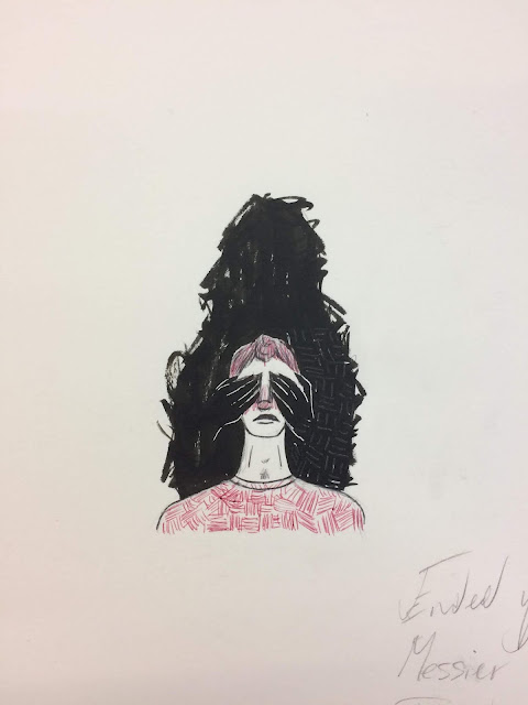
To the right is my more developed version of the original
sketch. Although it is not fully complete, I did enjoy the direction in which
it was heading, and I had enjoyed experimenting with the patterns and textures
in this design.
In this refined piece, after discussing it with Laura, I
decided not to include the words as I believed the character would look more
ominous without them, and possibly allow the audience to form their own
ideas/narrative for the piece instead of the message being so obvious.
From all of the people who have come in to teach us so far,
I enjoyed this lesson the most because I felt the artist was the most
relatable, in the sense of the direction in which I want my career to go. I
feel she gave amazing advice on how to get started and how she works, but I
also enjoyed the experience of working on a real brief that she had
completed.
Comments
Post a Comment